Designing a shared vision, service strategy and site wide navigation
I uncovered key insights for the Co-operatives UK website redesign project and supported the team to look at their business in a completely different way.
Client Co-ops UK
Consultancy DOT Project
Duration 3 months
My role User Researcher, Prototyper
Activities User Interviews, User testing, Workshopping, 1-2-1 interviews, Synthesising data, Generating insights, Interactive prototyping, Client presentations
THE IMPACT
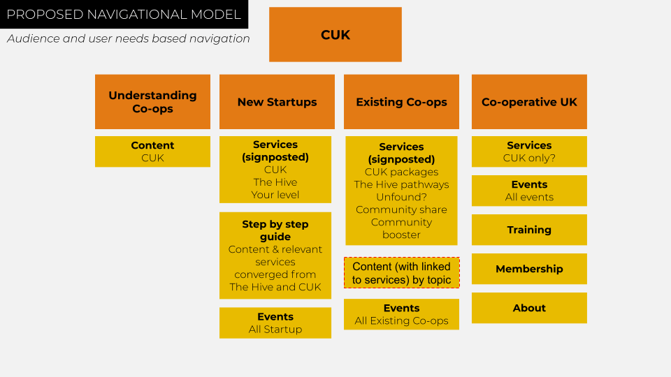
New navigational model based on user goals
The findings from my research gave the project confidence and the direction on how to structure and plan the website redesign project. All 5 websites and services now have a single clear portal that signposts users based on their high-level goals and desired outcomes – see uk.coops
Organisational alignment around user goals
The insights I uncovered created powerful conversations and laid the ground for organisational change centered around the user goals.
The problem to solve..
How do you create a unified navigation on one website that blends all the content and services of 5 websites while ensuring people can still find what they are looking for?
Inside out thinking
Co-ops UK team had tried to solve this problem by mapping all web pages onto a spreadsheet and then apply logical, ‘best guess’ content grouping. While that can feel like a sensible approach, it is ‘inside out thinking‘ i.e. solving the problem from the organisations perspective rather than the users.
I wanted to show the Co-op’s UK team an alternative way of creating a navigational structure. A user outcome-based navigation that can only come from user research and outside-in thinking.
From which perspective are you thinking about your users?
Uncovering the user goals
A variety of user research activities to understand what the user journeys and goals were :
Workshopping with SMEs Supporting the mapping of the key audience’s goals or outcomes rather than by demographics.
As an activity for the Co-ops UK team, this took a bit of adjusting. I was asking the stakeholders to let go of departments, teams and funding initiatives and just talk about their customers’ needs.
Workshop materials
White board collobrative working with stakeholders
Interviewing SMEs While the workshops gave me a broad view of the users, I needed to dig deeper to uncover their motivations and journeys in more detail. I was particularly interested in team members that had regular contact with users.
Talking to the contact team Contact teams was (and usually is) where the gold always lies. These are the people that speak to the customer every day. I started by asking what the common contact calls were. Initially, there were a lot of enquiries. However, we were able to give group them into themes. This was vital in distilling down all the noise into a shortlist of rough user goals. It also showed me where the website was letting users down. Why were they calling up for support and not using the website?
Surveying users I created a survey with the team to further probe and understand user needs and motivations drawn from the workshops. Helping us validate our initial assumption.
Key insights
Creating a mental model for new co-ops Users struggled to create a mental model of the steps and sequencing needed when starting a co-op.
Low understanding of what a co-op is 29% of survey respondents indicated that they are somewhat or not very confident in understanding what a co-op is.
Interest in supporting the movement Lots of users indicated they felt supporting the cooperative movement was important.
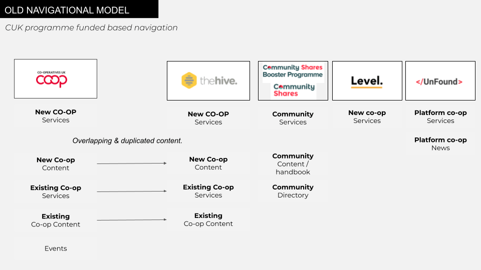
Overlapping and duplicated content Users get confused as they transverse across different and overlapping journeys of support from CUK. This was also due to services that overlapped support.
Website navigation The website navigation and finding relevant content consistently came up as the no.1 issue. This was due to users trying to achieve various tasks but not recognising which micro-website or service would support them. However, users weren’t looking for services. They were looking for support with their problems.
Grouping audiences by goals, not demographics
As the research indicated, users struggled to find the support they needed as they had to start by guessing which service was relevant for them. It was a navigation that reflected the internal business structure outwardly to the users or inside out navigation. We needed to look at this from the outside in. After reviewing all the various sources of information, and data points, there was a clear theme of user need emerging. While Co-ops UK served 1000s of different co-operative businesses, who had a variety of needs, it was possible to group them with a commonality :
New to co-ops
Existing co-ops
Public
And funders, investors, partners
I created a ‘Job to be done’ style goal to each group, which looked more like this:
New to co-ops
“I want to understand about cooperatives.”
“I want to start a co-op.”
Existing co-ops
“I want to get support for a co-op.”
Public, funders, investors, and partners
“I want to engage with the wider cooperative movement and community.”
Designing for audiences based on their goals (rather than services available) was now a critical assumption I needed to validate. This could unlock the challenge of converging multiple websites into one.
I started by creating a map (below) of existing services and content against audiences. It helped to visualise how customers were moving across the different sites, based on the goals I had identified. By viewing the websites in this way, it was clear why users were struggling to find the right content.
A high level map of the old website navigation
Forming a hypothesis
Pulling the assumptions, insights and user goals together, I was now ready to create a working hypothesis and a prototype to validate it.
We believe..
a navigational model based on user needs will make it easy for people to find what they are looking for
the quickest way to prove this is..
Create a prototype of the website navigation and test it with users for common scenarios
and we’ll measure..
If users are able to complete their journeys needed to get support with their goals
Prorotyping
Using the customer need groupings, I had identified it was pretty easy to slot the services and content around a natural home.
First prototype
The next step was to iterate my prototype into something interactive that I could test with real users. I only needed to validate the customer journeys, so images and ‘look and feel’ weren’t important at this stage. I set up a free account with notion.so, a wiki platform that allows you to spin up simple no-code web pages quickly. Using the customer goals as the starting point, I designed a no-frills homepage and navigational links. I added links and landing pages to some of the subsections. Which helped provide a quick link if users needed it, further clarifying the meaning and give context. I could now test user journeys.
I.e. if you wanted to learn more about co-ops, where would you go? If you needed to launch a new co-op, where would you go?
Low-fi prototype in notion
Now I had a physical artefact. Instead of telling Co-ops UK, I could show them. I could now engage with the stakeholders differently and connect our work to create an outside-in view.
User testing
While aligning and getting feedback from stakeholders is valuable, learning how real users interacted with the prototype was valuable.
To do this, I set up a series of zoom calls with people from the core groups; New to co-ops, In an existing co-op, a funder wanting to learn more about Co-ops UK. I asked them what their core goals were relating to their business and how they try to meet them. I asked them to see if they could find support with these goals via this ‘new website’. I wanted to establish if users could immediately sense where to navigate based on their needs.
In every instance, users were immediately able to navigate correctly within seconds. They all reported that it seemed very easy and logical. It appeared my hypothesis was correct, and the prototype was working well. While I was only able to test on around 10 participants with qualitative research, it’s about indicators and degrees of confidence. As every test proved positive, I now had more confidence in my overall approach to redesigning the website.
Sharing the story with the wider business
I created a story that the business could recognise, connect to and get behind.
Slides from final playback
Following the success of the project after go-live I co-presented a case study on this with the marketing manager of co-ops UK at Practitioners Forum 2020.
Slides from case study presentation at practitioners forum
Creating new conversations
The research I had taken strongly indicated that focusing the new website navigation around user goals created a positive and simple user experience. This was critical to the projects success and enabled the design and development teams to move forward with a solid foundation. The stakeholders also found it easier to understand their own business. They begun to explore the possibility of aligning team org structure and KPI’s all around these 4 user goals. My research impact went far beyond expectations of website navigation and opened the door for teams to think wider than the website.