My journey through journey mapping
Throughout my experience, I’ve found the process of journey mapping to be an invaluable exercise, particularly when trying to unite teams around a common and shared understanding of a service. Journey mapping, user journey mapping, and service blueprinting are all different flavours of this process, creating visual maps centered around a user’s journey.
In this post, I reflect on the diversity of the journey maps I have created, how I build them, and, most importantly, the different types of outcomes they have helped achieve.
Why & when to journey map?
Creating a journey map fosters a shared understanding of the user’s journey, uniting siloed teams and highlighting their impact on the user experience. It encourages collaboration, empathy, and problem-solving, while identifying new opportunities. I find journey maps most effective in a “divergent space,” when exploring and seeking alignment on opportunities, typically after conducting qualitative research early in the design process.
Journey map live examples
Through creating numerous maps, I’ve learned that there are many types of journey mapping, each serving a unique purpose. Here are a few examples of how I’ve tailored different formats to achieve specific goals for various audiences.
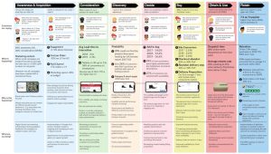
Legacy fashion retailer
Intent : Communicate sales funnel challenges, customer voice, and UX impact to the executive board.
Method : Collaborated directly with digital heads and combined insights from users.
Outcome : Provided the department with a visual understanding of their impact on the user experience for the first time.
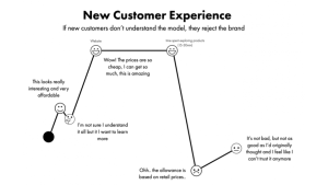
Startup subscription service
Intent : Communicate emotional journey of new users understanding a subscription model service.
Method : A series of key customer moments mapped in sequence to show the emotional journey.
Outcome : Founder and executive team had full buy-in and clarity on why their startup had struggled to scale.
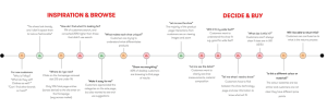
Startup fashion brand
Intent : Communicate and share customer experience of brand to wider business at keynote session.
Method : Selecting key moments from user insight and charting along a journey for keynote presentation.
Outcome : Trust from the business that we had understood their customers and buy-in to the new designs
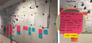
Startup fashion brand
Intent : To broadcast the user insights and support and communicate my design process.
Method : Mapping an existing journey, with new components, pairing with market comparisons & insights from research.
Outcome : A department that had no experience in UX evidence based design became highly engaged in the process
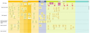
Digital Consultancy
Intent : A tool to facilitate conversation and business development within internal team.
Method : Mapping an existing journey, with new components, pairing with market comparisons & insights from research.
Outcome : Team got more clarity of the client experience and how to improve the hand-offs between phases with clients.
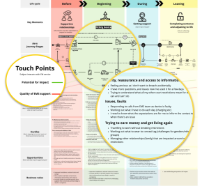
Government solution provider
Intent : To be a source and influence on the solution design for a tender process in a large government tender process.
Method : Mapping user insights against different phases of the service with backstage dependencies.
Outcome : Solution architect and bidding team had clarity and alignment on how to shape the tender around the user needs.
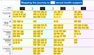
Health service
Intent : A prioritised set of opportunities that improve the service with buy-in from health practitioners and end-users.
Method : Co-created ideas and aligned on priorities, for different service roles and end users.
Outcome : The co-hort became aligned around the common experience of the end-users and potential solutions
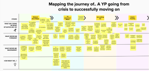
Mapping a service
Intent : Collaborative team mapping a charities service to identify opportunities for innovation.
Method : Co-created ideas and aligned on priorities, for different service roles and end users.
Outcome : The team self identified a golden opportunity for innovation and lot of additional ideas for service improvement.
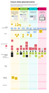
Blueprinting with user needs
Intent : Align team on how solution responds to user needs at different aspects of user journey.
Method : Mapping a traffic service and connecting user needs to technological solutions.
Outcome : The design and technical team could understand how their work connected, and proirtise the subsequent sprints.
Journey mapping principals
Here are some principles I’ve developed when considering a mapping exercise with clients:
Are you clear why you are creating a journey map? Is it alignment, to communicate at a high level, find areas for innovation? Being really explicit with your intent can ensure you actually get the outcome your looking for.
While the thought of having a shiny PDF of a journey map or big wall may be enticing, i’ve found the magic happens in the collective creation of the map. Its the conversations that are sparked the ‘aha’ moments that can only happen when people witness the assembly of the map rather than the finished output.
A big fail I had early on was to assume that senior leaders would know alot about their customers. The richest insights comes from people who have day to day contact with end users. Call centre staff, social media, shop floor, logistics and returns teams. That said, having a few senior stakeholders to witness the assembly of the map can be very powerful.
Swimlanes; the rows that provacate at each stage. There are some common ones that work on most maps, but liberating yourself to make your own swim-lanes can superpower your map towards your intended outcome.
Some typical swim lanes i’ve used are :
- What’s happening
- What do I feel
- What moves me forward
- What moves me backwards
- How do we measure this?
- Whats the opportunity here
- How might we?
Some usual ones :
- Why is this challenging for the organisation?
- What key decisions am i making
- What influences me?
- Behavioural bias
- Business value
- What do we need to know now for the next stage
- What’s important to me?
- What are highs/lows
Have a go at rough steps before session (people get hung up on this
I’ve tried many times to get a group to map the stages, and yet it always seems to take ages and people who’ve not done journey mapping generally find this a strange concept (as they are being asked to cut horizontally rather than in the silos of delivery they are used to. I would suggest having a rough go at the first middle and last step then getting them to tweak. Asking if this is ‘good enough’.
Kicking off with an empty journey map template is too cold. Start with an empathy map of the core user or groups. This drops people into the right mindset and makes the mapping much easier. Just 10-15min max will do.
Mapping can be tricky with a group larger than 6. The loud voices take over and the quiet ones withdraw. Best to separate them and do more journey maps in smaller groups and compare and converge them later.
Mapping is tiring and people get sleepy quickly. Take breaks but also check-in. You can ask “How do you feel this is going?, What are you learning?, What has changed for you? “
By writing the post its yourself you are immediately limiting the bandwidth of what can be captured. You’re also limiting the conversation to a certain format which for nero-diverse and people that need the quite space to reflect and think can be quite un-inclusive. It also lets some people ‘check-out’ and not fully enagage. So if you can insist that people write their own post-its (virtually or real world)
The temptation for people writing on post its can be to put one word or if writing by hand do it quick and sloppy. This stops other people from reading or understanding. If in person insist people keep it clear and legible. Each post-it should have enough on it to make sense on its own.
My final reflections
In my experience, it’s the conversations, disagreements, negotiations, and “aha!” moments during the map creation process that shift mindsets, create buy-in, and establish consensus for change. The end map usually becomes outdated within a few months, having already fulfilled its purpose—to align and co-create a shared understanding of users’ experiences.
In some cases, I’ve created maps on my own as a researcher to communicate with a broader audience. This approach works well for simple maps that highlight key moments.
Journey mapping has been invaluable to me, unlocking numerous stalled ideas and shifting the mindset from solutions-first thinking. It will continue to be a pivotal process in my work with clients.
Oh and one more thing..
With some audiences I map in excel, here is a template you can use/copy/steal In google sheets.
Related articles
No posts were found for provided query parameters.